Playing

Can’t stop making galaxies! 

I’ve always loved the night sky (hence my screen name – byul=star in Korean, gzr=gazer). It makes me extra happy that it’s so easy and therapeutic to make. 😄

Stamps used: Mama Elephant (PandamoniumSpace Bears); Lawn Fawn Beep Boop Birthday and matching die set); Hero Arts August 2017 My Monthly Hero kit, unfortunately sold out); Unity Stamps (Big Time Special)

Other materials: Memento, Tuxedo Black ink (SSSEH, also at Michael’s and Joann); Versafine, Onyx Black ink (SSSEH, also at Michael’s and Joann); Versamark (SSSEH, also at Michael’s and Joann); Ranger Stickles (silver); Embossing Powder, (white, black); Jane Davenport watercolor, Brights PaletteFinetec Gold; Dr. PH Martin’s India Ink, white (Set 1); Brusho (24 set)

I enjoy playing with my watercolors – on different paper and mixing different watersoluble media together. Can’t wait to play around some more!

Lessons learned

Today I took some time to make a card for my niece, who is graduating from middle school. I recently found one of the Joann exclusive Mama Elephant stamps, and since it was on sale, I snagged it. 🙂

So here is my card:

The inside:

I loved the way the unicorns and rainbow came out (see the beautiful sparkle? Love my clear Spectrum Noir sparkle marker!):

Things I would do differently next time:

  1. Add the sentiment first. As you can probably see on the inside, there is a shiny streak on the pink glitter paper that looks like it’s been melted. This is because it was melted. 😣 I added the sentiment last, and the embossing powder was flying away, so I heated it from behind. Unfortunately, this melted the glitter paper.
  2. Skip the glitter for the shaker portion. The whole point of this design was to be see-through, so you can see the unicorn from the outside. Because of the glitter you can hardly see the other shaker bits, let alone the inside. I want to say that I regret adding glitter to any shaker cards, about 75% of the time. So don’t do it!
  3. Skip the ink spray on the inside. Again, the design was meant to have the inside visible even when the card is closed. I thought the white background was a little bit too plain so I wanted to add some color. Unfortunately, spray inks are unpredictable, and I honestly don’t like anything about it – color placement, etc. 😣 
  4. Most importantly, plan ahead! I knew that I would need to cover up the inside panel (to cover the shaker portion). However, I didn’t think to die cut the window before I adhered the shaker part (with very strong adhesive), so I had to eyeball it. Hence the very wonky placement of the glitter paper. Actually all of these issues could probably have been prevented if I could just plan ahead. 😅

Funny story, I added enamel accents to the unicorns’ eyes. I accidentally smeared the one on the inside, but it kind of looked like eyelashes, so I kept it. Happy accident~

    #latenightcrafting #nomistakesjustlessons 

    Other products: Versamark inkStampendous detail white embossing powderJane Davenport Mermaid MakersJane Davenport Watercolor – BrightsAkashiya Sai Watercolor Markers, Copic Spica Pens (Set A and Set B), Ranger Enamel Accents (black), various watercolor pencils

    Still obsessed.

    Tonight I decided to play with the most expensive paints I own, the Mission Gold 36 set. 🙂

    I painted another grouping of florals using Permanent Rose, Bright Opera, Lemon Yellow, and Rose Madder for the flowers and Prussian Blue, Olive Green, Sap Green, and Yellow Green for the leaves. The berries are Ultramarine Deep. 

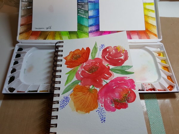
    At first I didn’t like the way this turned out, but the more I look at it, the more I like it better than my first painting. It definitely took more effort and I basically had to change the “flower” of the bottom left and top left (the more orange flowers) to look more like poppies because they ended up looking like big blobs. 

    I’m really enjoying experimenting and getting to know my paints better. I watched tons of YouTube videos about the pros and cons of Mission Gold. A lot of people complained that these paints don’t flow very well, and do not layer well. I don’t find that to be true. I thought they flowed easily and I was able to layer pretty well when in was fixing the 2 orange flowers. But then again, I have no other artist grade watercolors to compare them to, lol. I have a few colors of Winsor and Newton from the watercolor class I took, but not enough to really make any judgment on the quality of them. (This is why I need them all, right????)

    I also tried a landscape tutorial from the Frugal Crafter. I really enjoy her videos, and highly recommend everyone subscribe to her. They’re really informative and she makes everything look so easy. I had to rewind several times, but this is what I ended up with:

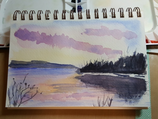
    If you can believe it, I only used 3 colors for this painting: Ultramarine Deep, Permanent Rose (she used Alizarin Crimson, which I do not have), and Yellow Orange (I believe she used Gamboge, but I do not have that one, either). I cheated a little bit on the black and added a little indigo as my grey was looking more purple. I think that may have to do with the fact that the Ultramarine in this Mission Gold set is a mix and not a single pigment. (So, another reason I should get another professional artist grade set, right???)

    Her painting was much softer and more watercolor’y, but mine turned out ok. I didn’t have all the brushes she used, so I made do with my round brushes (no flat) and a fan brush (no dagger), but it was more likely user error, rather than the lack of the same brushes, lol~ 

    I. Love. Watercolors!

    Obsessed…

    Hello, my name is Haejin and I’m obsessed with watercolors. I want to own every set and I can’t stop watching videos on watercolor reviews and tutorials….

    About a month ago, I took a floral watercolor class with Jenna Rainey, and I loved it. Anyway, since then, I’ve been really into color mixing and watercolors and more watercolors!!

    Being 9 months pregnant, it can be a little challenging to get comfortable to sleep at times. Tonight was one of those nights so I decided to practice watercoloring. 

    I used pretty cheap brush from Daiso (a set of 5 brushes for $1.50) in size 12, and my Prima Confections Watercolors (the Tropical set, currently on sale at Amazon.com) on my Strathmore watercolor journal.

    I definitely need to work on balance and, of course, making prettier flowers, but I was pretty happy with how it turned out. I was kind of not thinking and almost just mind-dumping, but with watercolor.

    And, I gotta say, I love this WordPress app. So much easier to post from my phone. Not the greatest pictures, but, hey, this is more for me anyway. 😄

    Late night crafting..err…practicing

    Jennifer McGuire is the queen of techniques. So I was pretty excited when she featured a technique that I had previously tried – perfect pearl powder with layering stamps. I was so excited to try it again, with her extra tips. 

    I didn’t get a great picture, but the bottom layer (the darker pink on the body) is stamped with Versamark and covered with Pink Gumball perfect pearl powder. I then stamped the third layer (I skipped the second layer) with just Versamark, which removes the perfect pearl (this was the awesome tip from Jennifer’s video). The face and legs were stamped with a pink ink. I can’t quite capture the sparkle, but it’s really pretty. 

    I also tried this with a pineapple layering stamp (same set).

    (Again, blurry photo.. it was late, lol~ I really need to take a photo class). You can see the sparkle better for this one. I’ll have to practice a little more to figure out how to get all the excess powder off without removing too much from the image. I tried a dried cloth (Jennifer’s suggestion) and a swiffer cloth. They both removed powder from the image. Maybe the key is waiting for it to set? 

    Techniques like this make me really really really want the misti… 

    Blessed

    Last Monday, my life group girls threw me an impromptu baby shower. Everything was so beautiful~~ It was a Monday, but all the ladies came to celebrate with me, and I just felt incredibly loved and spoiled. 😍 I seriously have the best life group!!

    I made simple thank you cards for them using a Heidi Swapp stamp and my Wink of Stella, Copic Spica, and Spectrum Noir Sparkle pens. 

    Not the best photo, but look at all that glitter! 😄

    Stamps used: Heidi Swapp Only You; Simon Says Stamp Big Scripty Greetings

    Other items used: Wink of Stella Markers; Copic Spica; Spectrum Noir Sparkle pens; white embossing powder.

    Beautiful Girl

    A card and vellum envelope I made for a friend for the birth of her beautiful daughter. She’s so tiny!!

    Stamps used: Mama Elephant Charmed

    Also used: Zig Clean Color Real Brush Markers.
     

    Edit: funny – this is the last stamp I used on my previous project. 😂 But I’ve actually been making a lot of cards and creating a lot more lately. 😄 

    #sharehandmadekindness

    image

    Jennifer McGuire is an amazing crafter and has an even more amazing heart. She has launched a campaign encouraging people to #sharehandmadekindness. 🙂 This is a card I made for my mom’s birthday. I kept it pretty simple and it’s pretty much a one layer card. I used this new-to-me Charmed stamp by Mama Elephant and stamped it on an off-white textured yardstick. I colored it with Prismacolor pencils. I hope she enjoys it~ 🙂

    #sharehandmadekindness

    Soul on fire

    image

    Dear Lord,
    I want to run for your heart. I want to run for you hard. I want to be a soul on fire. Lord, please give me strength to run hard. Please, give me a passion for the things that you are passionate about. Please, give me a bigger heart. Please, put my soul on fire, Lord.
    In your precious Son’s name I pray,
    Amen.

    Patience….

    I have none. I know it. It usually leads to small mistakes, but every once in awhile, it ends up in the complete ruination of a project:

    image

    Super sad…:'(

    I was too impatient to wait until the liquid watercolors dried to add the plastic sheet on this DIY palette. It was so pretty, too…

    image

    Super duper sad. :”””(